How To Pick a Color Scheme for Your Workplace

Choosing colors for your workplace can be a daunting task, especially if you have many spaces with different functions serving a lot of people. There are many questions to consider:

  •  What mood do you want to create?
  • Do you want the color scheme of your office to be light or dark?
  • Do you want to walk into a space full of fresh, invigorating energy or an oasis of peace and calm?
  • Do you prefer a look that is casual and laid-back or something more formal and tailored?
  • Do you need to include existing furniture, decor and accessories or are you starting from scratch? 

You can take a completely intuitive approach and go with everyone’s favorite colors – or you can try one of the more of the tried and true ways described below.

Let’s begin with just a dash of color theory. This is the color wheel you’re probably already familiar with. It’s a very handy tool for doing anything with color. I will be referring to it throughout this article.

1.       Complementary color scheme.

This can be a powerful solution, because it is based on two colors that augment and amplify each other. To find a pair of colors like this, pick any color and then look directly across the color wheel for its opposite, or, in color-theory speak, its “complement.” Popular examples are blue and orange, red and green, purple and yellow.

2.       Analogous color scheme.

This option is based on colors that are similar to each other. Pick a color and then grab its neighbor on the color wheel to arrive at an analogous color scheme.  It can be a color on the left or the right of your main one, or you can include both of the “neighbors” in your scheme. Examples: orange, red and purple.


3.       Triadic color scheme.

By definition, this color scheme includes three colors. To create a triadic color scheme, pick three colors that are the same distance from one another. A very common example of a triadic color scheme is red, blue and yellow (also known as primary colors). Imagine taking the triangle that includes these three primary colors and rotating it along the color wheel. Any of the colors that land on a triangle will give you a triadic color scheme.


4.       Monochromatic color scheme.

Although it sounds like a simple approach, a monochromatic color scheme can actually become an amazing aesthetic. Working from a single base color, experiment with hue and a variety of shades, tints and tones. Use contrast to bring in at least one darker and lighter shade of the original color. An effective monochromatic color scheme creates a feeling of balance and harmony and draws attention to room content.


5.       Neutrals.

It's worth pointing out that neutrals are not limited to shades of gray. White is a neutral color, as is black – though both of them pack some punch and can be overwhelming in large quantities. We often perceive colors of wood, either natural or stained, as neutral. Neutral colors tend to evoke associations with the natural world, although too much of beige, taupe and gray can make one feel tired.

A couple more tips:

  • Pick a neutral color to go with your color scheme.
  • Do not distribute your colors equally. Choose a main color and give it 70 % of the space;  give 25% to accent color #1 and only 5% to accent color #2. These numbers are arbitrary, and merely illustrate my point – have a main color and a secondary color, and then some accents. Avoid painting the four walls of a room all different colors (unless you are making a statement that you can defend in front of your coworkers).
  • Tap into your brand colors, if you have any. Is your logo navy blue with black and white? Take the blue and apply one of the color schemes above to it. Would it look good with a zing of yellowish orange (complementary), paired with baby blue and lime green or in concert with crisp red and muted yellow?
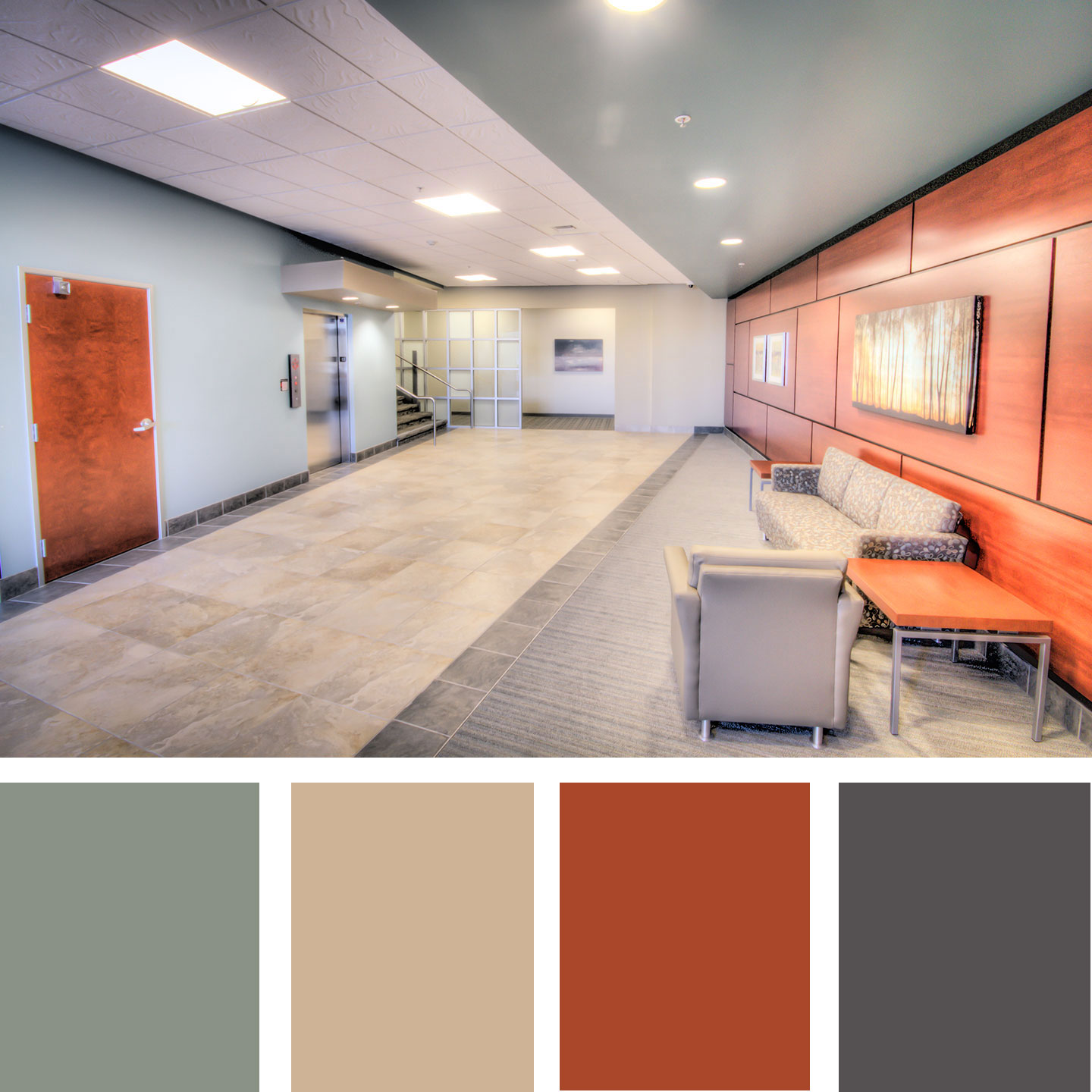
  • All of the color wheel colors can also be turned up or down in terms of intensity (saturation) and value (how light or dark the color is). Unless your office is also a day care center, you want the variety in both intensity and value (think muted vs saturated, light vs dark colors). The image below is an example of a complementary color scheme with very muted and grayed-out mint color and vibrant reddish-orange wood tones. The whole space feels natural and fresh.

And if, after going through all the color schemes, you still make your decisions based on your intuition – go for it! At least now you know there is a rhyme and reason for it.

Need some help making these important decisions in your office remodel? Give us a call today!

Living Building raising the bar in Sacramento

Recently, some of our colleagues participated in a tour of the newly opened Sacramento office of Utah-based Architectural Nexus. Kenner Kingston, president of Architectural Nexus and building designer, led the tour. The building has been entered into the Living Building Challenge and the company is pursuing LEED Double Platinum certification. Easily the most ambitiously environmentally conscious facility completed in the region, this architectural office is designed to be a self-sufficient, “living” building. 

The upgraded facade of this former warehouse building sports glass and metal elements. 

Beginning with the strategy of adapting an existing, former warehouse, structure to reduce waste and new construction impacts, it incorporates a number of low and high-tech strategies to manage power, water and waste.  From Solar Energy collection to fully composting, on-site sewage treatment, to rainwater and graywater collection and re-use, the systems integrated into the building design make the building a truly net-zero plus building. 

The green wall, made of living plants and supported by the building's graywater, brings the outside in.

The building is designed to grow a limited amount of food on the site and incorporates a “living” wall at the building entry which, beyond being a stunning piece of decoration, acts to help balance the water systems in the building.  Light and air quality are high priorities in the design.  The use of solar tube skylights in the work areas creates a work space which requires no additional electrical lighting during a typical daytime work period.  Materials, from finishes to furniture, and even materials in the walls were selected to specifically avoid known toxic substances and off-gassing to protect air quality in daily use and in the event of fire.

Lit by skylights and windows, the main open office area does not require artificial lighting during average work hours. The operable windows provide natural ventilation. 

Beyond the physical design, the building recognizes the importance of user responsibility and lifestyle to truly support the intended environmental function.  Employees are encouraged, through transit waiver programs, incorporation of on-site shower facilities and electric vehicle charging stations (with company provided electric vehicles coming soon), to reduce their commuting carbon footprint by walking, biking, and using public transit to get to work.  Employees are also tasked with maintenance and janitorial duties in the building to offset wage inequities in employment and encourage stewardship of the building systems.  As part of the holistic approach to this new office environment, the company employs the transparent use of the Social Justice Label from the Living Future Institute.  This Social Justice scorecard posts the company’s performance in the categories of Diversity, Equity, Safety, Worker Benefit, Local Benefit and Stewardship as measured by a third-party metric.

The tour was inspirational and informative, and an open invitation was extended by Kenner Kingston to local architects to tour and use this building as a model for future projects.  He has offered use of the facility to tour prospective clients looking for a more environmentally and socially sensitive solutions in their building ventures.  This offering is a truly collaborative approach to encourage striving for a better world among the professionals who design and build it.

Kenner Kingston in front of the mechanical room, with state-of-the-art water and waste management equipment.

Celebrating Founder’s Day ─ CJA is 35!

In January of 1982, Don Comstock and Duane Johnson combined their respective architecture businesses to launch Comstock Johnson Architects, Inc. The founders quickly earned the respect and loyal patronage of the Greater Sacramento business community and beyond. The company expanded and in 1996 Dan Eriksson and Kevin Wilcox joined Don and Duane as additional owners. We have grown and flourished and today CJA is 35 years old!

At CJA, we believe in building people as well as structures, celebrating small daily victories and also the big wins. We are technically proficient and passionate about integrity. We honor tradition while constantly innovating and improving ourselves in all that we do.

Founders Day donuts are a tradition every January. Don't worry, we do get donuts more than once a year!

Founders Day donuts are a tradition every January. Don't worry, we do get donuts more than once a year!

Congratulations and thanks to the founders and the dedicated CJA team!